Task1 - Thumbnails,
For this
task, I had to make thumbnails as images to be used in games. We
started off with Alex making us play a really old game that he played as a
child called rick dangerous (which I
was naturally bad at) to show us the differences between how an object
transaction between the many sprites which are attached to the object their
might be. In the game the same sprite are used as tiles to make the background
and edges of the level. Sprites are also layout as tiles as a huge map of
sprites. Alex said this is useful when selecting sprites in game engines as all
we have to do is crop it down.
After all that, Alex made us create our own game images and environments as thumbnails. The best part is we had to chose what type of game these images will be used in. I didn't know what to base the thumbnails that I will be making on, so I researched some really old school games. Many genres came up, for example puzzle, platforms and fighting. The games which I research where super Mario bro, worlds hardest game and the really old fighting games that you would get on console.
platformers and puzzle games where layed out simply and I wanted to challenge myself.
I personally liked the fighting genre, so I choose the fighting genre to make the thumbnails. I set a goal of creating at least 6 characters, 3 objects to make the game realistic and 2 backgrounds.
platformers and puzzle games where layed out simply and I wanted to challenge myself.
I personally liked the fighting genre, so I choose the fighting genre to make the thumbnails. I set a goal of creating at least 6 characters, 3 objects to make the game realistic and 2 backgrounds.
I started off by making the 1st 2 characters. The first one being a boy who special moves where fire related. The second character is a girl and her special move are energy related. I made a template of both characters then worked on the moving animation. I learnt that I don't need to create the character as a flipped version because I can edit that on a computer.
To make life easier for myself I used tracing paper to recreate characters and change the perspective of the legs so it would look like the character was moving. Each character will have different strengths and weaknesses and I plan on making a profile for the character to be used for character selecting when game starts.
I wanted these characters to fight in front of tourist attractions. So I made the 1st scenery of the Eiffel Tower, which isn't bad so far. I also made objects as tiles for detail in the Eiffel Tower scenery. I made 1 fountain and 1 bush. I also made the player interface images. Sprites that show and informs the user about variables in the game, for example a win/loose/end screen, health points and the cool down bar for special moves. This relates to when the character weapons are fully recharged and they can do the special move again.
 |
| making the scenery and objects to be in game |
Later on I decided to redraw everything and remove some stuff to make my thumbnails a lot more neater, I made it neater by re-organising every image I drew grouped together. The images i removed where the extra detail because i realised i can use the same battle scene but the background could change.
After that I drew all my characters on one separate page, all scenery on a separate page. and all the user information interference are on one separate page. Now the only challenge i have is drawing all thumbnail onto one sheet of A3 paper, which is really difficult because all my scenes are quite big. The scene i decided to draw where the Taj Mahal, Eiffel Tower, Statue of Liberty and the Leaning Tower of Pisa. I didn't bother colouring the Taj Mahal because it was the worst scene i drew, I completely rejected the Taj Mahal.
 |
| scenery to be used in the background |
 |
| all characters thumbnails in coloured versions. |
 |
| Eiffel tower as final A3 |
 |
| character 1 as Final A3 |
Task 2 - Digital Drawings.
After I finalised my A3 sketches, I had to choose one which I
would make a digital copy on the computer using Photoshop, the task required me
to make the canvas size 1920*1080 pixels.
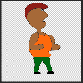
I decided to make character 1 as a digital drawing. To make
the character I used a Wacom tablet, which is basically a drawings tablet.
Drawing the character
was really hard, because I wanted it to be as pixely as possible but my character wasn't pixely but more rounded square. When drawing
the character I found it was hard because the canvas size was to small as the
dimension were 1920*1080 pixel so I change it to 1920*1920, this gave me a lot
of space to work on,
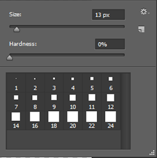
I used the Wacom tablet with a square brush from Photoshop to draw an outline of the character, then I used the line tool in Photoshop drawing over the outlines, to give the character more sharp edges so it would pixely look,
I used the Wacom tablet with a square brush from Photoshop to draw an outline of the character, then I used the line tool in Photoshop drawing over the outlines, to give the character more sharp edges so it would pixely look,
When I 1st coloured in the character I used the same colours
and filled in the places with no detailed whatsoever, however it didn't look
pixely as the colours I used to fill it in were solid.
So I used a shading and highlight technique by using the
brush tool to paint white and black over my character with the layer
transparency set to a low level, this would give a lighter and darker shade of
the fill colour.
After this I merged all the layers together and resized the canvas sized to how the task wanted it to be 1920*1080. Now the character is complete and finished and its looks like an old retro fighting game from the 1st play-station.
After this I merged all the layers together and resized the canvas sized to how the task wanted it to be 1920*1080. Now the character is complete and finished and its looks like an old retro fighting game from the 1st play-station.


No comments:
Post a Comment