Friday 4 November 2016

2D Animation

Task 4

For this task i had to make a variation of animations. There where 12 rules for animation. They made the animation feel more realistic and alive. They where:
  • Squash and Stretch 
  • Anticipation
  • Staging
  • Straight Ahead and Pose to Pose
  • Follow Through and Over Lapping Action
  • Slow In and Slow Out
  • Arcs
  • Secondary Actions
  • Timing
  • Exaggeration
  • Solid Drawing
  • Appeal
The animation i had to make included;
  • Death Sequence.
  • Explosion.
  • Walking.
  • Running.
  • Jumping.
To be able to do this i need a Tile-set of a sprite doing the action. I decided to download one of Pikachu from spriters-resource.com . The tile-set was good because it had every animation i needed to make except for the explosion. So i used the same website to download a tile-set for an explosion animation.


In the making of the Animation i used the software Photo-shop. The way i made the animation was not the most efficient way to make animation. I had to copy and paste each tile individually into one new Photoshop project then i had to use the timeline feature and create a new frame by showing the next layer and hiding the previous. I sometimes also had to expand the canvas so the sprite would get cut off when i pasted it in the new photo shop project. When creating the animations i had to get the delay right for every frame. The delay stayed at 0.2 seconds for most frames however it was 0.1 seconds for some and other animations had a mix between 0.2 and 0.1 seconds. The jump animation for example, i had to decrease the delay a little bit when Pikachu was going into the air. 
These delay setting made Pikachu Jump made the jump more believable. I noticed that it wasn't necessary for all delay to be the same. So i made changes to the delay for every animation so it would be believable. This are the delays for all the Other Animations. 


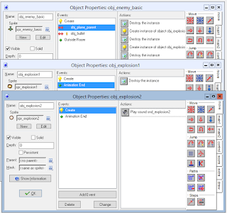
Now all the animations are done i put them into  a game-maker room. where all the animation would be looped. Game-maker made the animation faster than they were i had to reduce the frame per second from 30 to 10 so it would normal. 

Here are all the animations.
Dead

Explosion

Idle
Jump
Run
Taunt
Walk

Tuesday 11 October 2016

Wingman Sam

The next game i made is called Wing Man Sam. This is a multiplayer game, where the player's controls 2 different plains and their objective is to defeat a wave of enemy plains and then eventually the boss.

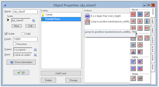
In the making of this game at the 1st stage  i learnt how the background could make the screen go in a direction that looks like as if the player is moving. This is called the illusion of motion and is know as as a Scrolling Shooter game.I did this in game maker by changing the Vert Speed to a value of 2 in the room properties background tab, next i worked on 3 different island popping up,and going downwards, as if the plains moving forward.  This was easy to do as it only required me to make a create event to move in a direction (downwards relevant to background) and then outside room event to jump to a random location back to the top of the screen.
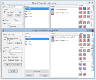
#In the second stage of making the game i focused making the planes object and most importantly the two-players controls. the controls for the planes where WASD and arrows. I only worked on movement so far in this stage, however i had to make the plane parent and work on the parent later. I did the control in a weird way, but it works. I made it so the player wasn't allowed to leave the room.
In the third stage of making the game i worked on the bullets that plane would shoot to destroy their enemies. This was kinda simple to do as it was only a key-pressed event, which would create an instance in relevant coordinates (0,0) of the plane object, moving in a constant direction upwards on a create event then when its outside the room, the instant would get destroyed, i also had to create a variable called can_shoot, so the game would register the amount of time the plane would shoot, this is also useful when developing the health of the plane and boss object later on in development.
In the next stage i worked on the how the bullet react when it gets in contact with the enemy plain and how the explosion object would show up. I did by making a basic enemy object with a controller object which would count the steps then randomly spawn a wave of enemy plains, which only moved in a direction downwards, and if the object made with contact with a bullet the enemy object would destroy itself and show the explosion animation.The explosion animation is an object itself which would go through all of its sub images of the sprite and when it reaches the end it would destroy its own instants.  If the enemy made contact with the plain object it would restart the game, and when the enemy object is outside the room, the instance would get destroyed. This object is a great parent object, however later in we want the enemy to move in directions other than downwards
After that, i worked on the boss object and how the enemy wave might have spawned and how they would try to defeat the players.. I did the enemy waves and boss spawn as a timeline. After a certain amount of steps waves of enemy would spawn then eventually the boss. i also worked on the health bar as well on player one and 2 a swell as the boss and then lastly i worked on how the boss would die. Unfortunately i ran into a bug where as the boss would crash the game and i haven't been able to fix the problem. This was a really simple game to make as it involved a lot of parenting. When making this game i saved around 7 version where everything was working the only problem i ran into was that the software would crash after the boss was defeated. As i progressed i removed the random enemy spawning as i relied on the timeline to do everything. i also made a lot of different enemy plains using the enemy basic as the parent object and i changed the way it moved and shoot. some plains moved sideways, and some plains had faster bullets. I also added a start for this game, this wasnt in the the tutorial pdf when making wing-man sam, and the game only relied one level as it was a scrolling games. so i couldnt make anymore.

When making this game i learnt a lot of new things on how to make games. The most important thing i learnt was the timeline and the the Vert Speed for the background. I will hopefully use these tools for making my own game, 

Pictures Representing Rochdale

In this task i had to take pictures and show how they represent Rochdale and explain the settings i used to take these picture. First of all i going to what the settings mostly show. They consist of ISO, 
aperture, and shutter speed.

When using a camera a person can change these setting by using the noble button -the thing that looks a scroll wheel. ISO means how sensitive the camera is to light.Aperture is referred to the size of the hole that lets light in. a bigger number means a smaller hole to let light in.Shutter speed means for how long the camera lets the light in before the picture is taken.

The 1st picture i took, was a tunnel that people - mostly 6th form students, used to get into town so they can do what ever they wanted to do. I manged to take this picture on 1st try with the setting making this picture look like as if the figure like person is entering some sort of heaven.
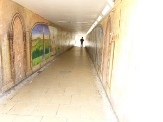
1st image, the tunnel to heavens
 The setting i used was an ISO of 800,  Aperture of 6.3, and shutter speed of 20. The reason why i took this picture because it represent the people in Rochdale being independent and they choose their own path and then face it. (just random bs)

In the next picture i took, it was a view of everything rochdale was known for. This included The 6th form college, The river Roch and lastly one building of the seven sisters. This picture also came right on 1st try, the aim in making the picture was to make it look like a nice day in rochdale being peaceful and stuff, which rarely happens as it always rains in rochdale.
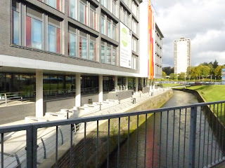
2nd Picture, rochdale famous landmarks
The settings i used in this picture was an ISO of 3200, aperture of 8.0 and shutter speed of 3200, the reason i did a fast shutter speed was because i wanted to take the picture when it was sunny and the clouds would sometimes block the sun, so therefore as soon it got really sunny i took the picture instantly. This picture as i hinted before shows rochdale good side, giving rochdale a good impression to tourist, and that is the reason why i took the picture.

The 3rd picture i took, was a picture of one of the parks in rochdale town hall. This shows that rochdale cares about its environment and keeps some of the green to help the environment. did you know that rochdale has about 7 different parks and woodland areas you can go to, if you include the Middleton borough this would lead to 11 different parks in total.
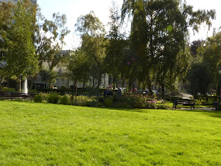
3rd image, rochdale is green.
The settings i used to take the picture was an ISO of 400, aperture of 8.0 and shutter speed of 500. The reason why i took the picture with these settings because i wanted the picture have more green and these settings gave more green than other ones. also i really like this picture because it has balance into it, it makes people what are behind the trees as they can only see the grass clearly.

The next image i took was a memorial grave of something, i dont know why i took this picture, it just interested me. I guess it represent rochdale history as rochdale like to leave a mark of their history. I like how this picture has a balance of how things are centred and symmetrical. I also like the grey and green colours, they go really well with each other. The setting i used in this picture was an ISO of 800, Aperture of 2.8 and shutter speed at 2000. 
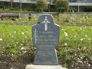
4th image, what was history.
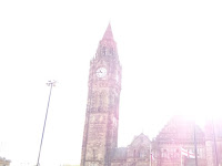
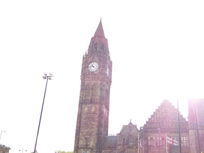
The next image i wanted it to be a picture of rochdale clock tower in a perspective as if the person was looking up to it, and i wanted it to be really bright and only the clock tower to show, i kept getting the setting wrong because the picture was too bright so i lowered the sensitivity of the light, i would of got it on 1st try if the camera pre-viewed how the image would look. i had to take this image 3 times to get it on the right setting decreasing the ISO majorly. In last setting which i like i got the setting at 400 ISO, 2.8 aperture and shutter speed at 2000. The only thing which i changed within the 3 images was the ISO, and im pretty sure i dont need explain why as you can see below.
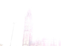
5th image, wrong settings
5th image second try, wrong settings
5th image, final settings. The clock.
The reason why i took this picture was because its has a major aspect in rochdale, the clock-tower and the town hall is like the heart of rochdale, people go into the town hall to register birth certificates and to get married, and obviously the clock tower tells us the time, which is very important.

This last image is kinda a joke on how it represent rochdale, this shows that the government hate the birds that have habitats in rochdale because they dont want people to feed them. I like how the images forces the person to read from top to bottom at the angle it is at, this image has some path and perspective to it. the setting i got this image at where an ISO of 400, aperture of 2.8 and shutter speed at 1000. I wanted this kinda preservative for the clock tower at night, however it works with the sign too
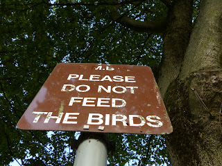
6th image, government hates birds.

Wednesday 5 October 2016

Lazarus & Super Rainbow Reef

Task 3 - GDD and 2D Games Engine

For the next part of task 3, I learnt the long and short ways of repeating code. I made 2 games.
The 1st from chapter 4 and the 2nd form chapter 6.

The 1st game where i had to alot of repeat code was lazarus. Lazarus is a tetris-like platformer game. The player controls a character which is a purple slime ball. Heavy boxes randomly spawn on top of Lazarus (purple slimeball) and the player has to move Lazarus from left to right to avoid from getting crushed by the box.
lazarus title screen
The player has reach to the end of the level (which is really high up) and the player is able to climb to the end as the boxes would stack on top of each other. Eventually this would lead a path of boxes on-top of each-other for the player to climb.

gameplay of lazarus
When making this game i saved 4 different version, each containing major aspects of the game.
The first version had the basic mainframe of the game. All the sprites, sound and player controls ready to be advance for gameplay to be changed. The last version had everything put together and working.
version 1 of resources
version 4 of resources
Whilst making this game i got confused a lot of time because i had to repeat the code and put slight variation depending on the property of the box.  
repeating code and changing due to the object property
(my struggle/confusion)
The second game i made was Super Rainbow Reef, This is a brick breaker like game and i made it quite quickly. When i was making Super Rainbow Reef, i made it alot faster than i expected, and as a total i made 5 version of the game at key stages of development. This is because the game had a certain structure of making it. A beginning, middle and end. This made me realize that organisation makes the development of a game more efficient.

In version 1 I started by making the beginning and end screen first. The end was easy to do as it only required  sprite to change a room with a single object inside and then it would show the highscore. Also at the end i changed the keybind from exiting game maker to going back to the start screen. The start screen was also kinda easy to do as it only consist of a mouse pressed event, which would lead to different action, like exiting the game or changing the room to start a level.

V1 organised

Start and End screens

In version 2 I worked on player controls. Before i did this i made a test room so i could see if the the player controls worked. This stage was mainly focused on how the objects - which represented the player would interact on the other objects like the wall. The only player interference was Katch. Katch would bounce back the ball like object in brick break - in this case the ball is pop, and pop would bounce of walls. Pop bouncing of brick was in the 3rd stage of making the game (version 3)

player interactions
resources for version 2

In version 3 i worked with a variety of different brick, they all has the same function which was to get destroyed and bounce back. So therefore i made the 1st brick a parent off all the rest. I also worked on the enemy object in this version. Like the blocks there were more then one enemy. So i made one a made the rest as parents. The parent one didn't move and that feature was added to individual enemy. The movement as also a parent for other smaller enemies.
enemy parenting code
similar objects, a lot of parenting
However some blocks had different feature and worked like powerup. Powerups where version 4 of the game and. This included how life's worked and how more then one balls where spawned. This was really easy to do as the life was represented in pop as a draw function and whenever pop left the room and there where no more pops left, a life will be taken away. If the player hit a life block one would be given. For spawning multiple pops (balls in brickbreaker) all that needed to happen was a collision event to create new instances.
power-ups blocks coding and pop interaction with blocks
Version 5 was really about making the levels. so therefor i left the testing level as it was. i can add more if i really wanted to, the only thing important to me if the game is working properly.
level making
gameplay

Monday 26 September 2016

Traditional Drawings & Digital Drawings.

Task1 - Thumbnails,

For this task, I had to make thumbnails as images to be used in games. We started off with Alex making us play a really old game that he played as a child called rick dangerous (which I was naturally bad at) to show us the differences between how an object transaction between the many sprites which are attached to the object their might be. In the game the same sprite are used as tiles to make the background and edges of the level. Sprites are also layout as tiles as a huge map of sprites. Alex said this is useful when selecting sprites in game engines as all we have to do is crop it down.
Rick Dangerous Title Screen
After all that, Alex made us create our own game images and environments as thumbnails. The best part is we had to chose what type of game these images will be used in. I didn't know what to base the thumbnails that I will be making on, so I researched some really old school games. Many genres came up, for example puzzle, platforms and fighting. The games which I research where super Mario bro, worlds hardest game and the really old fighting games that you would get on console.
platformers and puzzle games where layed out simply and I wanted to challenge myself.


I personally liked the fighting genre, so I choose the fighting genre to make the thumbnails. I set a goal of creating at least 6 characters, 3 objects to make the game realistic and 2 backgrounds.


I started off by making the 1st 2 characters. The first one being a boy who special moves where fire related. The second character is  a girl and her special move are energy related. I made a template of both characters then worked on the moving animation. I learnt that I don't need to create the character as a flipped version because I can edit that on a computer.


To make life easier for myself I used tracing paper to recreate characters and change the perspective of the legs so it would look like the character was moving. Each character will have different strengths and weaknesses and I plan on making a profile for the character to be used for character selecting when game starts.


the 1st two character in development
(template)
I wanted these characters to fight in front of tourist attractions. So I made the 1st scenery of the Eiffel Tower, which isn't bad so far. I also made objects as tiles for  detail in the Eiffel Tower scenery. I made 1 fountain and 1 bush. I also made the player interface images. Sprites that show and informs the user about variables in the game, for example a win/loose/end screen, health points and the cool down bar for special moves. This relates to when the character weapons are fully recharged and they can do the special move again.
making the scenery and objects to be in game
Later on I decided to redraw everything and remove some stuff to make my thumbnails a lot more neater, I made it neater by re-organising every image I drew grouped together. The images i removed where the extra detail because i realised i can use the same battle scene  but the background could change.


After that I drew all my characters on one separate page, all scenery on a separate page. and all the user information interference are on one separate page. Now the only challenge i have is drawing all thumbnail onto one sheet of A3 paper, which is really difficult because  all my scenes are quite big. The scene i decided to draw where the Taj Mahal, Eiffel Tower, Statue of Liberty and the Leaning Tower of Pisa. I didn't bother colouring the Taj Mahal because it was the worst scene i drew, I completely rejected the Taj Mahal.


scenery to be used in the background
I'm actually glad i made more scenes that i initially planned as it would make the game feel more realistic and interesting.When all the scenes where done i worked on the last 4 characters, i got lazy and reused some animation and body parts to make the last 4 characters. This however keeps the characters in a world which they all fit in and hopefully the players will be able to see the sync of the characters. All characters are given different strengths and weakness i want the game to have a feature where one character's weakness is another character strength  and it will make it better for the AI to play.

all characters thumbnails in coloured versions.
After making all my scenery, objects and characters, i had to decided one scene and one character for the final A3 thumbnail. i decided to use the Eiffel Tower scene and Character 1 for the  final A3 thumbnail. The reason why i chose the Eiffel tower was because it had alot of lines involved and i was able to use that to make it more pixely. I also tried making character 1 more pixely.  I did this by using sharp edges and diagonal lines. It still gave character one the rounded style i wanted however it didn't look smooth.


Eiffel tower as final A3


character 1 as Final A3

Task 2 - Digital Drawings. 

After I finalised my A3 sketches, I had to choose one which I would make a digital copy on the computer using Photoshop, the task required me to make the canvas size 1920*1080 pixels.

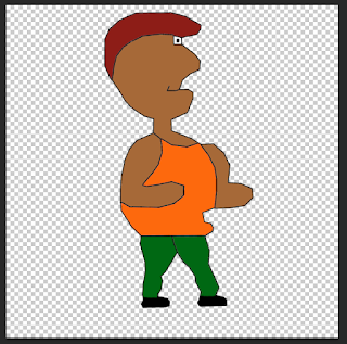
I decided to make character 1 as a digital drawing. To make the character I used a Wacom tablet, which is basically a drawings tablet.

 Drawing the character was really hard, because I wanted it to be as pixely as possible but my character wasn't pixely but more rounded square. When drawing the character I found it was hard because the canvas size was to small as the dimension were 1920*1080 pixel so I change it to 1920*1920, this gave me a lot of space to work on,

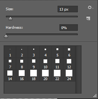
I used the Wacom tablet with a square brush from Photoshop to draw an outline of the character, then I used the line tool in Photoshop drawing over the outlines, to give the character more sharp edges so it would pixely look,


When I 1st coloured in the character I used the same colours and filled in the places with no detailed whatsoever, however it didn't look pixely as the colours I used to fill it in were solid.


So I used a shading and highlight technique by using the brush tool to paint white and black over my character with the layer transparency set to a low level, this would give a lighter and darker shade of the fill colour.


 After this I merged all the layers together and resized the canvas sized to how the task wanted it to be 1920*1080. Now the character is complete and finished and its looks like an old retro fighting game from the 1st play-station.